The Pickle Guy Company was establish in 1988 and has been hand packing jars of pickles and preserves ever since. The company was expanding and required the development of a logo, label redesigns, business cards, and a website.
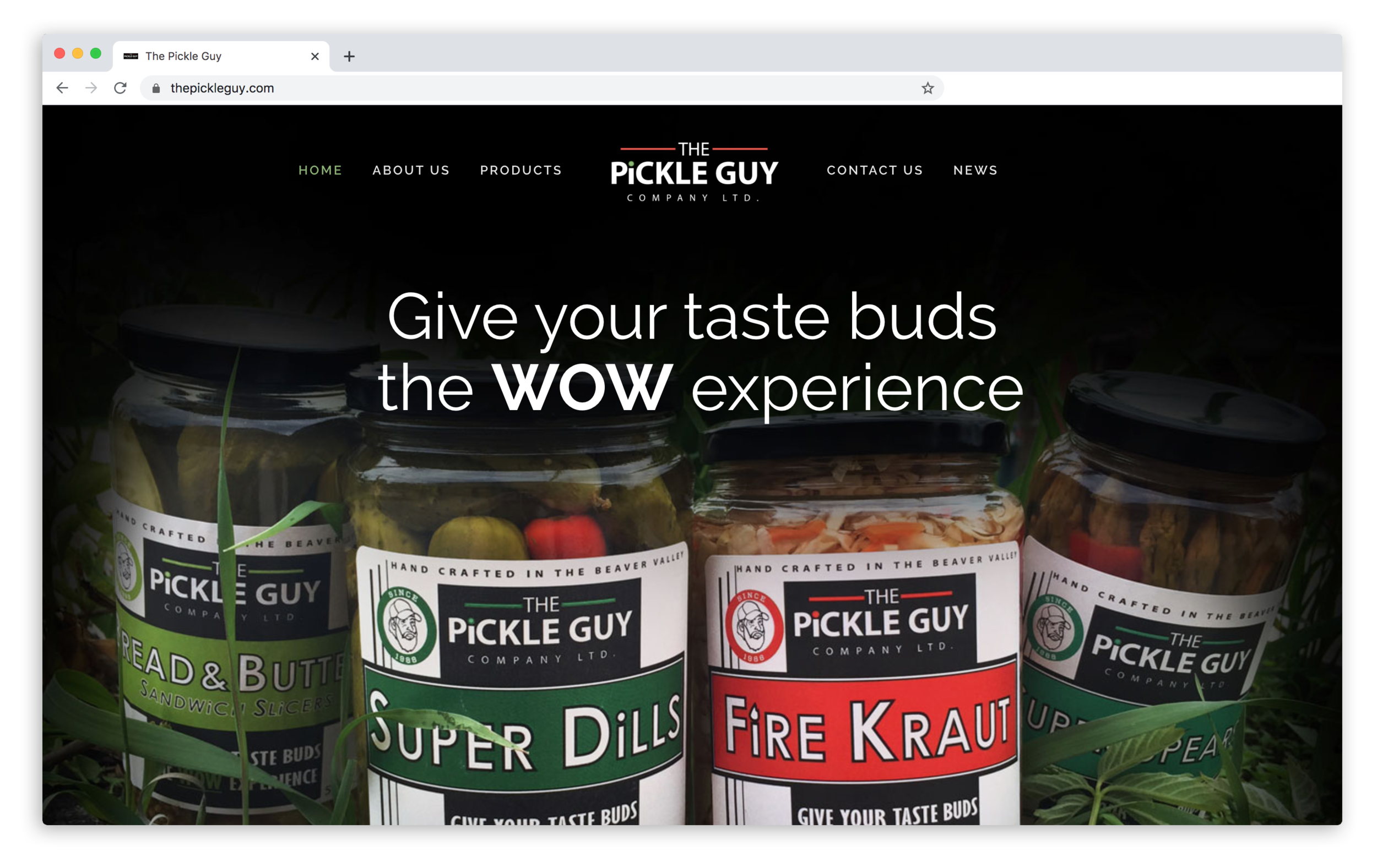
Many variations of the logo were created but in the end the company wanted something strong and bold. In it’s standard form it is a black rectangle with red lines and a green dot. The monochromatic variation is used for the business cards.
Before
After
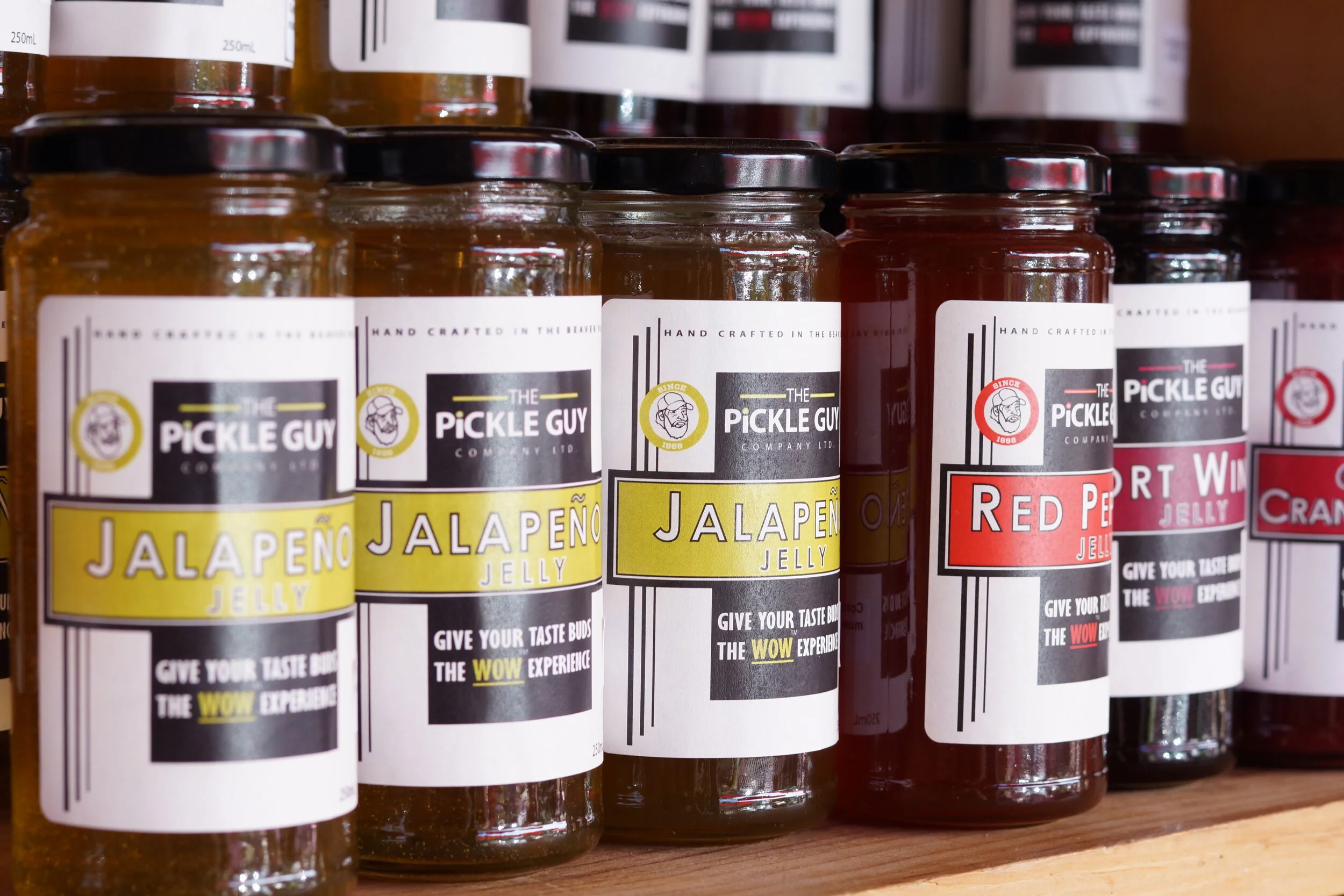
The new label was designed to stand out with it’s bright colours but also with the goal of maintaining it’s roots of a home-style family run business. The previous labels have a picture of The Pickle Guy himself faded in the background. For the new labels I created an illustration of him contained in a “coin”. The Pickle Guy offers over 50 different products and I designed a unique label for each one.


They did not have a website so I created a new one from scratch, designing the layout and navigation. I staged, photographed, and edited photos for all of the products. Uploading them and their nutrition facts into a searchable gallery. I created an interactive map with store locations where their products could be found. I also put together a news section containing articles that had been written about their products.